
A roundup of the great and good cyberSecurity threat maps
We’ve all seen them. We’ve all visited the website of our favourite cyber security vendor to take nosey at the current state of the cyber world. It’s what every cyber security vendor must have: A map!
No, I don’t mean Google maps. These are the types of maps that show when some dude in deepest Slough sends Conficker or Trickbot to an unsuspecting Frenchman about to tuck into his Brie.
They all tell you the same basic stuff:
- Origin of the attack;
- Target of the attack;
- Payload of the attack;
- General category of attack (Malware / Exploit / Phish / DDoS)
Some are a bit fancier than others, and some specialise in a specific attack vector, but they all usually give you some kind of round-up of the top targets or other general statistics about the size or volume of the attack.
It’s also worth noting that all these cyber threat maps plot the attacks that were thwarted. If the attack is successful, it means that it’s not been detected, and, thus, doesn’t appear on the map.
So let’s take a look at a handful of the contenders, starting with…
Checkpoint – Threatcloud
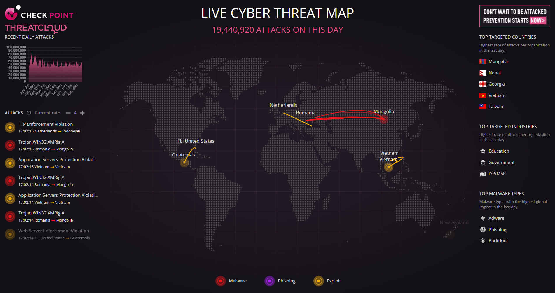
The Threatcloud is a catchy name from Checkpoint. This one appears top of the list when searching the big ‘G’.
It covers all the bases, too. Attacks are listed on the left-hand side and show the generic type and malware / exploit name being used. The map in the centre shows a swooping, bendy line from source to target. Granularity is poor. The map is quite small, too, so it would be tricky to see if an attack originated in, say, the Seychelles or a small Caribbean island. But, that doesn’t matter because all attacks come from China, don’t they??
Kaspersky

Next up, Kaspersky’s wild, wild ride. The image above belies the extravagant bad trip this map takes you on occasionally when it throws you down the wormhole of an ongoing “attack”:

When you land at the other you are blessed with a tour of the virtual canyon landscape, which appears to be the same regardless of where you land:

This site has a statistics page, which draws wonderful wavy lines, a threat buzz page and a rundown of the data sources used.
It’s not as immediate as the others, has a black-magick feel to it and kills your browser, but at least it does have a neat globe.
Radware

Radware’s effort is a very busy and statistics-heavy offering. Again, it’s got all the basic information, but it’s so overpowering it’s hard to take it all in. Countries flash when an attack is launched, but sometimes the trailing lines disappear into space. Maybe they are attacking the moon? Attack volumes are gathered at the bottom of the page, but there’s so much data on-screen that the browser showed the scrollbar.
FireEye

The FireEye map is a lot simpler affair and doesn’t strangle Chrome. Sweet looping lines are gracefully rendered from source to destination. The trouble with this map is the lack of context. It doesn’t show what type of attack is occurring for all attacks and sometimes the text is written over the top of other text, so you can’t make head nor tail of what actually happened. All in all, less FireEye, more FishEye.
Fortinet

This map leaves a lot to the imagination. The attacks hunt their target across the earth like brightly colour sperm wriggling towards their eggy prize. These shoot across the screen, which is another reason for my fertile analogy.
To be honest this is a disappointing map. The attacks are over in moments and they whiz past so fast you have no idea what happened and after a few seconds, you don’t actually care what happened because everything here is so vanilla.
Imperva

Now, Imperva claim this is a real-time threat map, but take a closer look at those dates. At the time of writing, this was simulating data from the previous 48 hours. Hardly real-time! Perhaps, the “coming soon” title is true. They need to do a lot of work…
Netscout

Apparently, this shows real-time DDoS attack data. I thought I was witnessing the murmuration of starlings. Let’s move on…
BitDefender

Hold on! Haven’t we seen this before? The map looks exactly like the Checkpoint one, only checkpoint removed Antarctica, which is probably sensible because internet connectivity is rubbish out in the frozen deserts.
This covers the same well-trodden ground. It’s simple and relatively uninteresting. Moving along, swiftly.
Digital Attack Map

In the immortal words of Monty Python: “And now for something completely different…”
Well, in this case, not completely different, but something mildly different. Digital Attack Map is a DDoS mapper which shows live data. It looks the part but is fairly static because DDoS attacks are ongoing, so if excitement is what you crave, please look elsewhere…
Talos

Those Talos boys from Cisco have thrown their hat into the ring with this fairly dull effort. To be honest it was probably thrown together on a wet weekend in Manchester (which is every weekend, by the way).
This ticks all the right boxes, but has no moving part, just some flashing paddles that look like they were google earth reject icons.
Let’s have a think about what we’ve seen…
An attempted summary
How do we do this? Mark them out of 10? A prize for the shiniest turd? I’m not sure I could recommend any of these. As with all these things, it’s a lot of snake-oil. Most of these maps are vomited up by the malware vendors who want to scare us into thinking that we’re always under attack. We are always under attack, whether malware is there to protect us or not. The best thing to do is shut the laptop, pull the power chord, roll over and cry…
Or, if you really enjoy watching Netflix, get on with it. It may happen. You may end up with Ransomware. And then again, you may end up being run over when you rush to get a lolly from the ice cream van.
A cyber-threat map is not going to help us. Let’s get out of here…
//SecurityX.
Leave a Reply